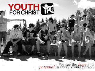
 Our last project was a Presentation Design. We had to make a power point on a non-profit organization or charity, but we had to make it look good. I used Youth For Christ Winnipeg. We were allowed to use any program for this project, we just had to assemble it together in InDesign and then turn it into a PDF slideshow. The only other program I used was Photoshop. I made 12 slides.
Thursday, January 21, 2010
Presentation Design
 Our last project was a Presentation Design. We had to make a power point on a non-profit organization or charity, but we had to make it look good. I used Youth For Christ Winnipeg. We were allowed to use any program for this project, we just had to assemble it together in InDesign and then turn it into a PDF slideshow. The only other program I used was Photoshop. I made 12 slides.
Packaging Design
 For this project, we had to find a box template and redesign a product with a nicer packaging design. I chose incense sticks. We had to do the whole project on Illustrator. We weren't allowed to have any images on our box. I used a gradient that went from the main colour to white, so that the image would blend in better. Then we had to print out our templates and actually build the boxes we designed.
Tuesday, January 12, 2010
Children's Book
Thursday, November 26, 2009
Design Resume
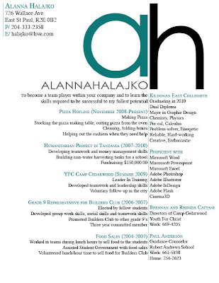 Next, we had to create a design resume. We were asked to bring in our resumes and design them up a bit. I started off by putting my logo on, and then slowly started adding text in. I played around with the text for a long time, until I decided to separate the text like the 2 letters in my logo. I made all the titles coloured so they would stand out more. Then I added a line down the middle to help separate it even more and make it more readable. I made this using InDesign.
Personal Logo
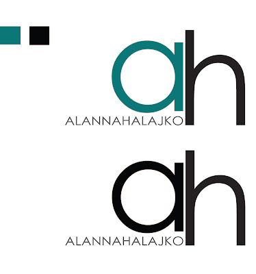 This is my personal logo. At first I had no idea what to do. I had 2 letters 'A' and 'H' and I had to put them together somehow. I started off by going through all the fonts uppercase and lowercase until I found a few fonts I liked. Then I started putting them together to see what I could come up with. I went through about 10 different versions until I settled with this one. I used Illustrator to make it.
Wednesday, November 18, 2009
Wordless Alphabet
 This project was my favorite. We have to chose 6 letters and create pictures of words that start with that letter, by using that letter! It was really fun to think of ways to create pictures using letters. I made these all using Illustrator. We have to find a good font, and then twist it, turn it, warp it and scale it to make it how we wanted it. Then we had to set it up into a picture of an object. It was a blast. Can you guess what each one is?
Grad Wear Sweaters
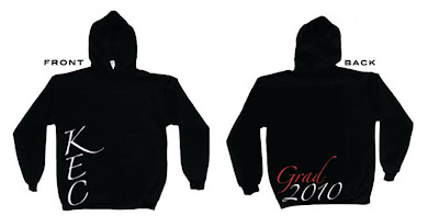 Our grad comity at school asked us to design some ideas for GradWear this year. I wanted something that was basic but to too simple. Something that people would actually want to wear in a few years still. We could only use two colours: red and white. On the back left corner I put 'Grad 2010' in an elegant looking font. I put it in the corner so it would be kind of off to the side. On the front, I put 'KEC' going down the side, so that it wasn't sitting in the boring center like most sweaters. It is still noticeable, and looks way better. I used Photoshop to do these.
Subscribe to:
Comments (Atom)


