
 Next, we had to create a design resume. We were asked to bring in our resumes and design them up a bit. I started off by putting my logo on, and then slowly started adding text in. I played around with the text for a long time, until I decided to separate the text like the 2 letters in my logo. I made all the titles coloured so they would stand out more. Then I added a line down the middle to help separate it even more and make it more readable. I made this using InDesign.
Thursday, November 26, 2009
Design Resume
Next, we had to create a design resume. We were asked to bring in our resumes and design them up a bit. I started off by putting my logo on, and then slowly started adding text in. I played around with the text for a long time, until I decided to separate the text like the 2 letters in my logo. I made all the titles coloured so they would stand out more. Then I added a line down the middle to help separate it even more and make it more readable. I made this using InDesign.
Personal Logo
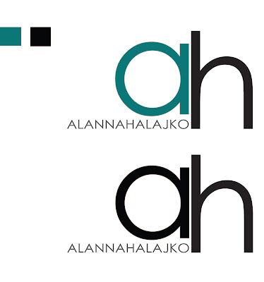 This is my personal logo. At first I had no idea what to do. I had 2 letters 'A' and 'H' and I had to put them together somehow. I started off by going through all the fonts uppercase and lowercase until I found a few fonts I liked. Then I started putting them together to see what I could come up with. I went through about 10 different versions until I settled with this one. I used Illustrator to make it.
Wednesday, November 18, 2009
Wordless Alphabet
 This project was my favorite. We have to chose 6 letters and create pictures of words that start with that letter, by using that letter! It was really fun to think of ways to create pictures using letters. I made these all using Illustrator. We have to find a good font, and then twist it, turn it, warp it and scale it to make it how we wanted it. Then we had to set it up into a picture of an object. It was a blast. Can you guess what each one is?
Grad Wear Sweaters
 Our grad comity at school asked us to design some ideas for GradWear this year. I wanted something that was basic but to too simple. Something that people would actually want to wear in a few years still. We could only use two colours: red and white. On the back left corner I put 'Grad 2010' in an elegant looking font. I put it in the corner so it would be kind of off to the side. On the front, I put 'KEC' going down the side, so that it wasn't sitting in the boring center like most sweaters. It is still noticeable, and looks way better. I used Photoshop to do these.
Event Posters

For this project, we had to chose 3 annual Winnipeg events and create posters for them. The first one I did was Fringe Fest. This one was really easy, because Fringe Fest is very unique. So there is pretty much no guidelines for what you can do with the poster. It could really be anything. I chose a picture of one of last years performers, and used the Fringe Fest logo. I also wanted to highlight the Kid's Fringe, because it's a great free way to spend time with your family. The second one I did was The New Music Festival. The theme for this year is earth. So I wanted to find a picture that related to it. Once I got the picture in, I started getting colours that would go well with it. I used lower case on the title, so that I could use upper case on all the other type, to make it look more noticeable. After it was all done, I added in some squiggly green lines, to give it that extra something. The last poster I did was Thin Air. I wanted to put books into this poster somehow because it is a writers festival. So I made a row of books like they are stacked on a shelf. I also wrote the the 100 reasons for the Thin Air festival ending with "awaits for arrival" and the date of the festival. I used a light background to bring it all together. I mostly used InDesign for all of these, but also used Photoshop for some of the pictures.
Team Blais T-Shirt

For this project, we had to design a shirt for a team. The theme was "Sparta". On the front he wanted to have the Rome style arena, so I used the coliseum. One the back, he wanted to have a sparta either praying, or standing and holding a helmet. I chose to do him praying. I did most of the designs using Illustrator, and then put my designs on shirts using Photoshop.
KEC Logo
 Next, our teacher wanted us to design a new logo for our school. I started thinking about this, and looking at other school logos, and found out that most schools like to put their mascot in their logo. So I drew a reiver (which is a man on a horse who fights in the 1800s) and I used his weapon to incorporate the type. I made the end of his weapon longer, and added 'KEC' above it. And then below it 'REIVERS' fit in perfectly. I also added a vertical line going along the 'K' to make it all come together nicely. I made this using Illustrator.
ASCD Logo
 This was our first of many logo projects this year. A company called ASCD wanted a new logo. They asked our teacher if she could get her students to make a new one. They wanted the same font for the letters 'ASCD' and they also wanted the word 'Manitoba' put on their logo. ASCD is a company that makes curriculums for schools and other things. So my first thought was to put a book or binder into the logo. By putting the book into the logo, it symbolizes that ASCD is all about learning, but it also symbolizes that there are lots of opportunities to be opened with ASCD. I made this logo using Illustrator.
Bud Spud and Steak
 For this project, we were asked to design a ticket for the KEC Football team's Bud Spud and Steak fundraiser. They gave us all the information we needed to put on it, and told us to come up with whatever we could think of. I wanted to make my ticket look fun, but also have a football look. I used big, bold fonts and made the word 'STEAK' stick out a lot. I also made the '&' symbol coming off the bottom half so the ticket had more depth to it. I put on a picture of a guy playing football to bring it all together. I made this using Illustrator.
Information Handbook
 For our first project of Grade 12, we have to design a new look for next years KEC Student Handbook. It took me a while to think of what I wanted to do. I had lots of ideas, but I didn't really like any of them. One day, when I was looking at clothes, I saw an argyle sweater and got an idea. I made the background argyle and added in some smaller argyle patterns in the corners to bring it all together. In one middle diamond I put a picture of a statue in front of our school, that all the grad kids sign. Then I added some text, and picked colours that would blend nicely. I did this using InDesign and Photoshop.
Subscribe to:
Comments (Atom)
